
Yes, this logo blows
On the subject of the 2012 olympic logo and its relative quality, I am told by the whole internets that the prevailing opinion is "it looks like Lisa Simpson giving a blowjob."
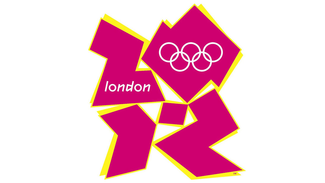
London must stand firm. They MUST NOT bow to pressure to abandon this hilarious and utterly appropriate logo! If this logo goes, the terrorists win.
Posted by
Johno
 on
| § 3
on
| § 3
on
| § 3

§ 3 Comments
[ You're too late, comments are closed ]
Oh .... magod.
Oh .... magod.
I will never ever be able to not see that.
How cool - it is going to make watching the Olympics so much zestier.
Wow. I tried really hard not
Wow. I tried really hard not to look at the logo too much the first time I saw it, because I didn't want my eyes to burn out of their sockets, but now, thanks to Johno, I will never be able to look at that logo again. (At least, not without a splash guard on my computer to protect it from the soda I am spewing out of my nose.) Wow.
That logo blows in ways that
That logo blows in ways that I thought hadn't even been invented yet.
Thanks for bringing it to my attention. And, by the way, I find it so easy to locate information that matters to *me*, based on the clear and comprehensive category tagging you've used.
If it wasn't for that, I'd have to actually read each post, and would then have to purchase time-wasting offsets.
So, thanks.