
In Praise of The Center
CalPundit notes an interesting phenomenon.
You know that map you see everywhere? The red-and-blue map of the USA that makes it look like the coasts are 100% Lib'ral Democrats and the heartland is solidly Conservative-By-God-Republicans?
Well, as it turns out, that map tracks very closely the map of states who are net contributors and net drains on the welfare budget. Ironically, "red states" who tend to vote Republican and whose politicians are most vocal about high taxes, the horrors of the welfare state, and the evils of Communist California, Taxachusetts, etc., tend to be net drains, getting back more welfare dollars than they put in.
That is, whereas big-government baddie Massachusetts puts in $1.75 to the welfare pool for each dollar it draws back out, small-government supporting Idaho draws $1.31 out of the welfare pool for every dollar it puts in. Thus, it almost seems as if the states that most resent the welfare system are the ones gaining the greatest benefit for the least input.
Check out the post for the maps and CalPundit's analysis.
I don't know quite what to make of this beyond a brain exercise. Like most brain exercises, it contributes little to a substantial discussion of American politics, and indeed obscures what's REALLY going on. The Red/Blue map is interesting, but it creates an artificial dichotomy where none exists. For a more nuanced view of the American political landscape, check out.....
This:
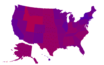
It's a map made up by Brad Delong, that takes the usual Red/Blue map and blends the colors to track the actual breakdown of Democrat vs. Republican electoral college votes cast in the 2000 Pars-dential election.
Instead of the stark, unbridgeable divisions that the red and blue map would suggest, wouldja look at that... it's all shades of... purple.
As Brad DeLong puts it,
No islands. No sharp divisions. No yawning cultural and sociological gap--just slightly varying shades of purple, mixed blue and red. Only seven states in 2000 had a Republican presidential vote share more than sixty percent. Only five states in 2000 had a Republican presidential vote share less than forty percent.The first map is false advertising--the combination of our quirky system of electing a president with the tendentious arguments political commentators interested in maximizing perceived differences.
The second map is reality.
Damn right. No totally blue states except maybe Massachusetts, home of the Conservative Democrat, and New York, home of the immense solidly Democrat immigrant populations of the outer boroughs of NYC. Only a few really reddish states in the middle of the West right where you'd expect them. You can see that the states with the biggest cities skew blue as urban populations tend to do, but there is no strong pattern among most of the rest. Mostly it's a world of subtle shades of purple.
Which is why it's such a damn shame that "the media" keeps harping on the differences. Sean Hannity, I'm talking to you, sport.
 on
| § 0
on
| § 0

[ You're too late, comments are closed ]